The D.A.T.A. Project
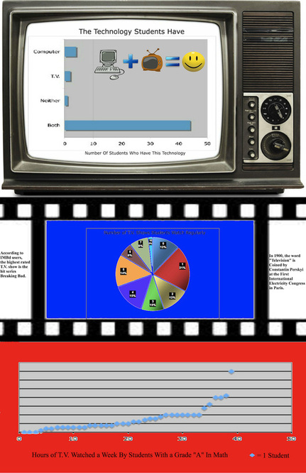
During The D.A.T.A. Project, our class learned how to collect, organize and display data creatively on infographics. Infographics are pages that show data of a certain topic with pictures and different types of graphs. Each of our final products had to include three different graphs showing qualitative, quantitative and bivariate data that had to do with our topic. For my topic, I chose Television. I had to ask 6 questions to my entire class team and put four of those questions into three graphs. My final questions were: 1. How many T.V. shows do you currently watch regularly? 2. How many hours do you watch T.V. a week? 3. What are your grades for Math/Physics? And 4. What kind of technology do you own? I created a qualitative graph with question #4, a quantitative graph with question #1 and a bivariate graph with questions #2 and #3. I learned that most people on my team own a computer, the most amount of T.V. shows regularly watched by one student is 10 shows and students who have a grade A in math/physics watch much more T.V. a week than I thought they would, the most being 39 hours a week. In the end, I was very proud of my finished product and thought it turned out great.